
The chart really speaks for itself
» Click image for larger version

 Registered User

The chart really speaks for itself
» Click image for larger version
Registered User
wow thanks ill be printing that off
Registered User
I'm not sure that, that's showing the whole picture.
Banned
absolutely epic.
Registered User
Originally posted by Diocletian
I'm not sure that, that's showing the whole picture.
Curious to as what is also missing in your opinion?
Super Nintendo Chamers
Originally posted by Diocletian
I'm not sure that, that's showing the whole picture.
Yep, also curiousOriginally posted by liquidboi69
Curious to as what is also missing in your opinion?
Registered User
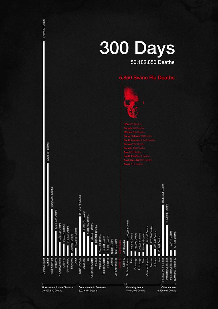
Cool picture. Whats the significance of the 300 days part?
Registered User

Originally posted by Seanith
Cool picture. Whats the significance of the 300 days part?
start of the so called epidemic i believe?
Registered User
its been 7 months since the first detection of the flu in Mexico. I think 300 just gives a better idea of what it has done in that time.Originally posted by Seanith
Cool picture. Whats the significance of the 300 days part?
Registered User
Thats what I thought, but wasn't sure. Either way its a pretty cool picture. This is going up on FB
Registered User
Regular influenza is missing, and pneumonia is also missing (unless it falls under respiratory infections). Age of victim is also missing (that plays a huge part in risk assessment of H1N1) Also, cause of death is a hard one to verify sometimes, if someone had heart disease and caught H1N1 and it stressed their system so much that they died of a heart failure would their death be swine flu or heart disease? If they died as a result of pneumonia brought on by H1N1 would it count as H1N1? Too many factors, not enough information. The chart is very nicely presented to downplay the risk though.
Success is the ultimate revenge.
Banned
H1N1 - The next money maker for medical companies.
I will not get it, and I have seen enough of these charts.
You're more likely to drown in a bathtub than die from H1N1
Registered User
It means in the last 300 days since swine was detected, 50million people have dies worldwide (average per year is 57) and of that only 5800 were from swine.Originally posted by Seanith
Cool picture. Whats the significance of the 300 days part?
sig deleted by moderator, click here for info
Super Nintendo Chamers
As far as I can tell "they" are quick to blame H1N1 on any related death. Canada for sure has only had ~80 deaths and they were ALL H1N1 along side some other ailment.Originally posted by abyss
Regular influenza is missing, and pneumonia is also missing (unless it falls under respiratory infections). Age of victim is also missing (that plays a huge part in risk assessment of H1N1) Also, cause of death is a hard one to verify sometimes, if someone had heart disease and caught H1N1 and it stressed their system so much that they died of a heart failure would their death be swine flu or heart disease? If they died as a result of pneumonia brought on by H1N1 would it count as H1N1? Too many factors, not enough information. The chart is very nicely presented to downplay the risk though.
From what I have read the "regular" infuenza kills between 2,000 and 8,000/year so really the H1N1 is a pussy cat.
Moderator
So, the chart shows that a number of common, uncurable diseases kill more people than a seasonal, curable one?
News at 11!
Registered User
The flu is curable?
Registered User
I heard the opposite version of "they" that pneumonia deaths especially were not attributed to H1N1 even though it was the initial cause of the pneumonia. Which is why I posed the question.Originally posted by syeve
As far as I can tell "they" are quick to blame H1N1 on any related death. Canada for sure has only had ~80 deaths and they were ALL H1N1 along side some other ailment.
From what I have read the "regular" infuenza kills between 2,000 and 8,000/year so really the H1N1 is a pussy cat.
Don't take it the wrong way though, I believe H1N1 is WAY over hyped in the media, it's the annoying "disease du jour". I definitely try not to subscribe to the infectious hysteria, but regardless of all that, the chart is still bunk.
Success is the ultimate revenge.
Super Nintendo Chamers
You could be right, I don't really believe anything I'm reading these days.Originally posted by abyss
I heard the opposite version of "they" that pneumonia deaths especially were not attributed to H1N1 even though it was the initial cause of the pneumonia. Which is why I posed the question.
Registered User
I would be more interested in seeing a similiar chart but just based on Canada / North America. Deaths from things like Malaria aren't really relevant here in Canada.
"Masked Bandit is a gateway drug for frugal spending." - Unknown303
Registered User
i like how h1n1 deaths equal just slightly more than leprosy
I'm a baller on a budget, I'll do a project and come back and tear the outlet mall up.
 Posting Permissions

 Quote
Quote